Wee3Beasties Website Redesign
Wee3Beasties is a non-profit cat adoption platform dedicated to giving a second chance to feral and special needs cats. Unlike commercial adoption sites, we prioritize the well-being of every cat and provide dedicated support and resources to ensure successful adoptions.
Role: UI designer, researcher, and prototyper
Problem: It is difficult for prospective adopters, donors, and sponsors to navigate the Wee3Beasites website and find relevant information. This is due to large blocks of text on the homepage as well as the unintuitive layout of the primary navigation.
Solution: Redesign the website to maintain the branding goals of Wee3Beasties’ founder while promoting donation and adoption to new users.
User Research
Stakeholder & User Interviews
We met with the founder of Wee3Beasties to determine their intentions with the website, how much traffic the website currently receives, and which elements of the website are essential to the brand identity. They revealed:
Website traffic is primarily to the Facebook group.
Increasing donations through the website is a high priority.
Bold colors are preferred.
After our stakeholder interview, we planned and conducted 3 interviews with users who believe in cat rescue, are open to welcoming cats into their homes, and who donate to causes important to them. From our interviews, we learned:
Homepage is confusing to read.
Information is difficult to find.
Adoption process is not accessible.
Ideation
After meeting our stakeholder, empathizing with our users, and defining the problem, we set about coming up with solutions to help users easily find information about adoption, donation, and care on the Wee3Beasties website.
Brand Positioning Statement
Wee3Beasties is a non-profit cat adoption platform dedicated to giving a second chance to feral and special needs cats. Unlike commercial adoption sites, we prioritize the well-being of every cat and provide dedicated support and resources to ensure successful adoptions.
Feature Prioritization
Interview data was compiled into an Affinity Diagram and Empathy map. From these, we created a feature prioritization matrix where we identified the major pain points our stakeholder and users identified in our interviews.
Most important to Users:
Website is difficult to see and interpret.
Adoption process is not clearly detailed.
No option to contact the organization directly.
User Path
We developed a user task that starts with logging into the website and makes all the stops along the way that lead to submitting an application for adoption. Originally we incorporated the FaceBook community group as a task, but we’ve since removed it as it wasn’t needed, though we still highlighted it on the site..
Task 1
User opens Wee3Beasties webpage.
User navigates to the ‘Cat Care Information’ page.
Task 2
User returns to the site and uses the primary navigation to find adoption information.
Most important to Non-Profit:
Donations are not highlighted.
Facebook page is not prominently featured.
There are no resources for people interested in adopting feral or special needs cats.
Task 3
User navigates to the cate page and browses the available cats.
Task 4
User selects a cat and clicks ‘interested in adopting…? Fill out this form.’
User fills out the form and waits to schedule an interview.
Prototype / Wireframes
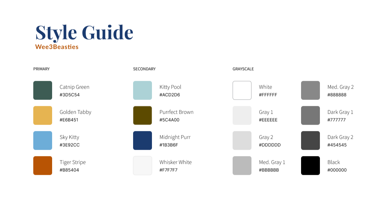
Style Guide
The current Wee3Beasties website is dated, not ADA-compliant, and confusing to navigate. The Goal with the redesign was to keep the vibrant colors and playful nature while modernizing and simplifying the design.
Wireframe Sketches
Working from the user path, we sketched wireframes to reflect the user’s flow of learning about the organization and beginning the cat adoption process. We compared the different designs to select features that we wanted to incorporate into lo-fidelity wireframes
Mid-Fidelity Prototype
Here, we were each assigned a page to work on. I prototyped the new Cat Care Information Page. Key factors going into the design were incorporating cat imagery, highlighting the Facebook group, and ensuring information was not presented in a manner that felt overwhelming or text-heavy.
User Testing
5 user tests were conducted on both the mid-fidelity and initial hi-fidelity prototypes. Across all pages, users noted an interest in increased spacing and less text where possible.
Final Prototype
Wireframe Sketches - Mobile
The Wee3Beasties website is not compatible with mobile devices. The body text overflows the background frame and is generally too small. When creating lo- and mid-fidelity wireframes, we wanted to make sure the content was big and bold for mobile users.
Existing mobile design
Mid-fidelity Wireframes
User Testing
5 user tests were conducted on both the mid-fidelity and initial hi-fidelity prototypes. Across all pages, users identified a need for improved header consistency, spacy, and less text where possible.


