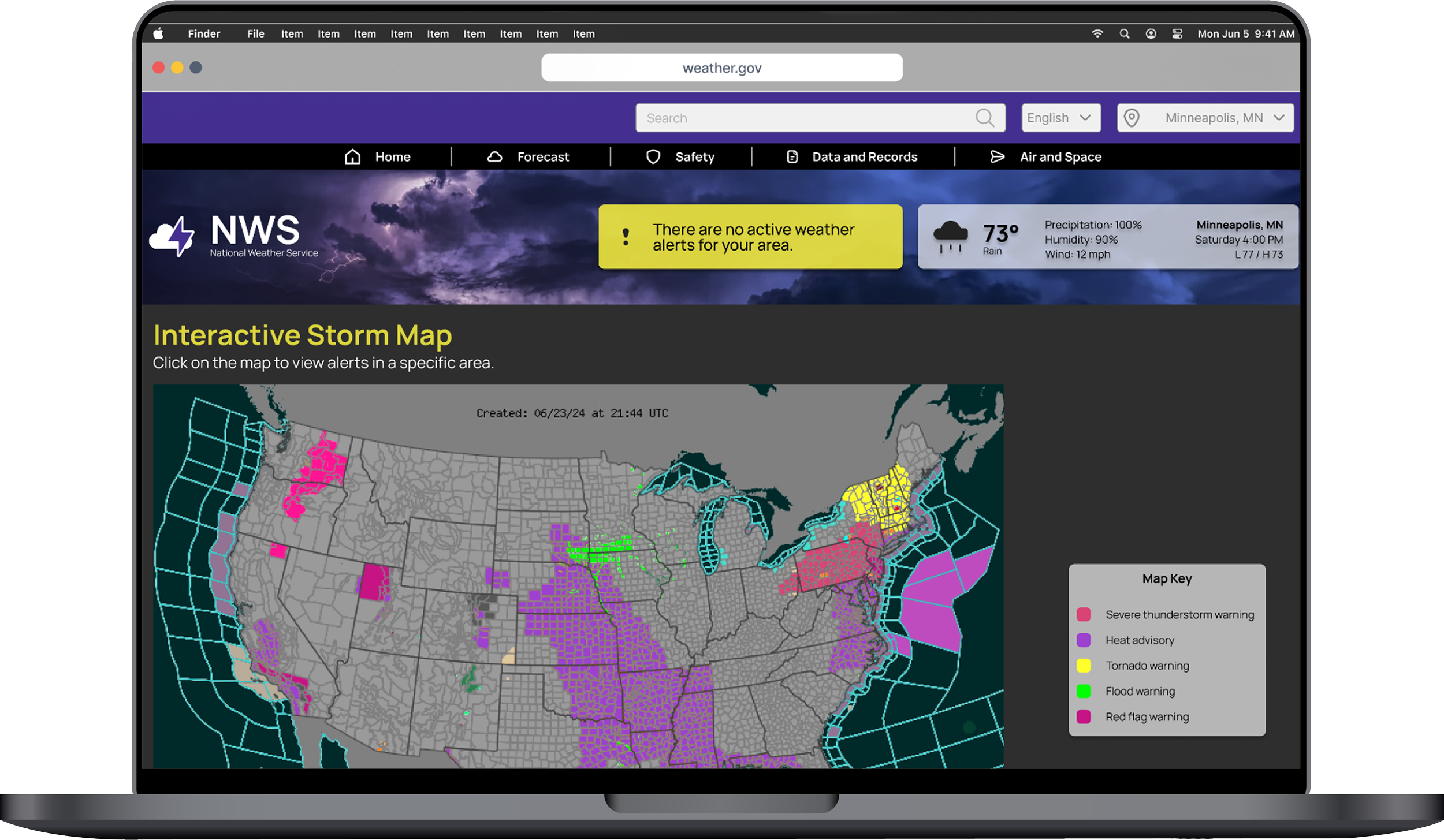
National Weather Service Website Redesign
The National Weather Service (NWS) is a U.S. government agency that provides weather, water, and climate data, forecasts, and warnings to protect lives and property.
Role: UI designer, researcher, and prototyper
Problem: The National Weather Service’s website is full of duplicative links and confusing to navigate.
Solution: Simplify the primary and secondary navigation and redesign the website to give it a simplified modern look.
User Research
User Path
A proto-persona was developed to guide the early stages of user research. I created a user path, following the anticipated actions of an individual using the National Weather Service (NWS) website to check for hourly air quality reports.
Usability Testing
I planned and conducted 5 usability tests following the established user path. Testing included the following tasks:
Navigate to the Air Quality page.
Find the air quality for Minneapolis, MN.
Navigate back to the Homescreen.
Users noted that the font size was too small, text on the screen was misleading and overwhelming, and the website was difficult to navigate
2x2 Prioritization Matrix
Heuristic, Usability, and Accessibility Analysis
Card Sorting
The current sitemap included eight main categories, each with up to twenty secondary links, making it cumbersome for users to navigate and find the topics they were seeking.
After performing card sorting, navigation was simplified by grouping similar topics into sub-categories beneath four main categories: Forecast, Safety, Data and Records, and Air and Space. This was done to streamline the searching and navigation process for users.
Prototype / Wireframes
Style Guide
The current NWS website lacks distinct branding, uses inconsistent graphics, and has a color palette that fails to meet AAA accessibility standards. The redesign will introduce new, accessible colors and remove duplicative content. Sleek and modern graphics will be utilized to reduce the need for large blocks of text where possible.
Homepage Lo-Fi
Wireframe - Desktop
Three pages were wireframed to test the updated navigation and sleek style.
Task 1: Navigate to multiple pages using the primary navigation (Current Weather, Air Quality, and Winter Weather Conditions).
100% accuracy on desktop.
88% accuracy on mobile.
Air Quality Story Submission Page Lo-Fi
Wireframe - Mobile
Air Quality Page Lo-Fi
Usability Testing
8 usability tests were conducted to determine the usability of both the desktop and the mobile homepage navigation. Two tasks were asked of each participant:
Task 2: Find contact information.
100% accuracy on desktop.
88% accuracy on mobile.
Based on these results, updates were applied to improve navigation on mobile and readability on desktop.


