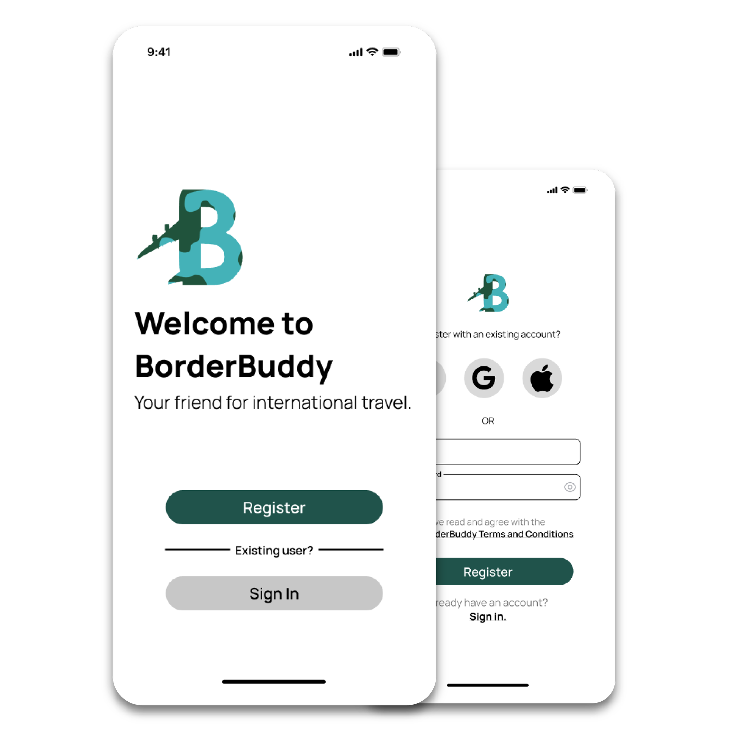
BorderBuddy Mobile Onboarding
BorderBuddy is a travel planning app that creates personalized itineraries for travelers to help them prepare for their international departure.
Role: UI designer, researcher, and prototyper
BorderBuddy, an in-development mobile travel assistant app, sought UX research and design services for onboarding and app functionality. I collaborated with their development and strategy teams to understand the purpose and need for each page.
Definition & Ideation
Definition
I put together a user persona based on the information provided to me by the BorderBuddy team. Their target user is someone who:
Frequently travels internationally
Lives a busy lifestyle
Is organized, or wants to be
Ideation
User Insight Statement
Azalea needs convenient and reliable access to important travel information, such as travel restrictions and requirements, because finding sources that are intuitive and plain language is stressful and time-consuming.
Value Proposition
BorderBuddy is developing an international travel logistics planning app to help international travelers solve the problem of researching and understanding the requirements and regulations of entering a new country.
We’re better because we offer custom itineraries for someone based on their nationality, destination, trip duration, etc.
We’re believable because we have repeat customers.
Problem Statement
Researching the entry requirements and regulations of a new country is stressful and time-consuming for international travellers. How might we develop a comprehensive resource for them to find the information they need in an accessible format and help streamline the logistics planning for their trip.
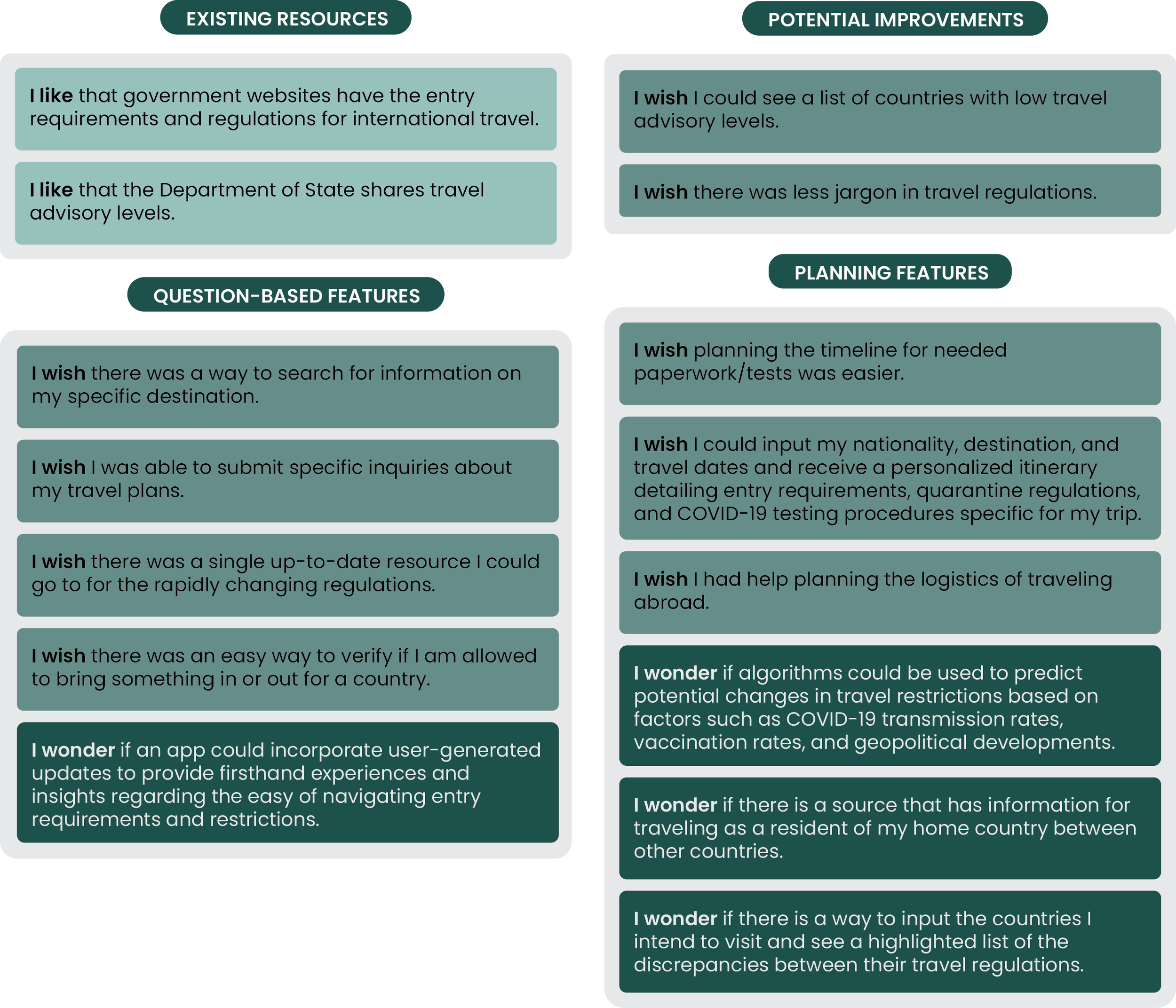
Using the approved User Insight Statement and Problem Statement, I began to look into what roadblocks someone like Azalea might experience while researching travel requirements and regulations. From this, I developed and sorted I like, I wish, I want statements.
I then worked with their strategy team to complete a feature prioritization matrix.
After determining the feature prioritization, I completed a value proposition canvas and drafted the value proposition statement.
I used the insight and information gathered during this phase of ideation to create a user scenario and storyboard.
Prototyping
After finalizing the storyboard and goals with the BorderBuddy team, I moved forward with a competitor analysis. Examining the existing features of direct and indirect competitors provided a framework for discussion with the team, allowing us to identify what we wanted to carry over into our designs and what we wanted to hold off on based on user feedback.
User Flow
Next, I presented a user flow to the BorderBuddy team. This user flow took into account our user scenario and key insights from our competitor analysis. For example, multiple sign-up options were a commonly appreciated feature that we wanted incorporated into our flow, offering users, like Azalea, low-effort registration opportunities.
Sketch and Mid-Fidelity Wireframes
I created sketch wireframes for the BorderBuddy team to approve. Once I received their approval, I put together a mid-fidelity wireframe of the corresponding screens to begin user testing and iterating.
Testing and Iterating
Guerilla Testing
Testing Plan
Objective: Identify any pain points in a new user creating an account and adding a trip to BorderBuddy.
Task 1: Register for a new BorderBuddy account.
Task 2: Add a new trip to user profile.
Testing Results
Task 1: Register for a new BorderBuddy account.
Users had no issues registering an account. There was interest in adding functionality to the Facebook, Apple, and Google sign-in options.
Task 2: Add a new trip to user profile.
Users had no issues adding a trip to their profile. There was an interest in larger progress trackers at the bottom of the screen.
General commentary
Users expressed interest in larger font sizes for headers and more variety in the homescreen layout.


